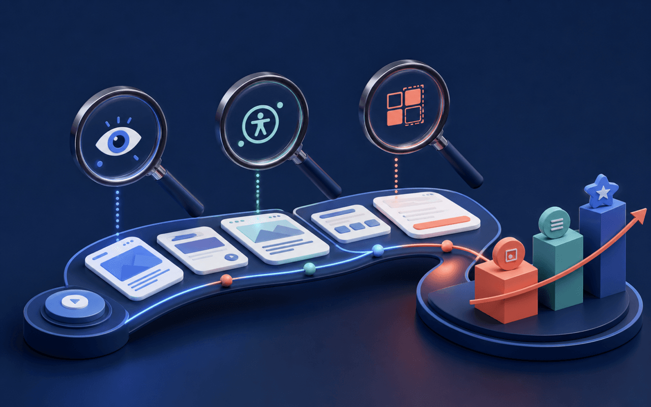
How Do You Design Data-Dense Dashboards That People Can Use?
Quick Answer: Design a data-dense dashboard around the decisions a specific audience must make. Establish visual hierarchy, show context and comparison, use consistent formats, and reveal detail progressively. Keep filters visible, label freshness and uncertainty, support keyboard and screen-reader use, and test the dashboard with realistic data and time-sensitive tasks.
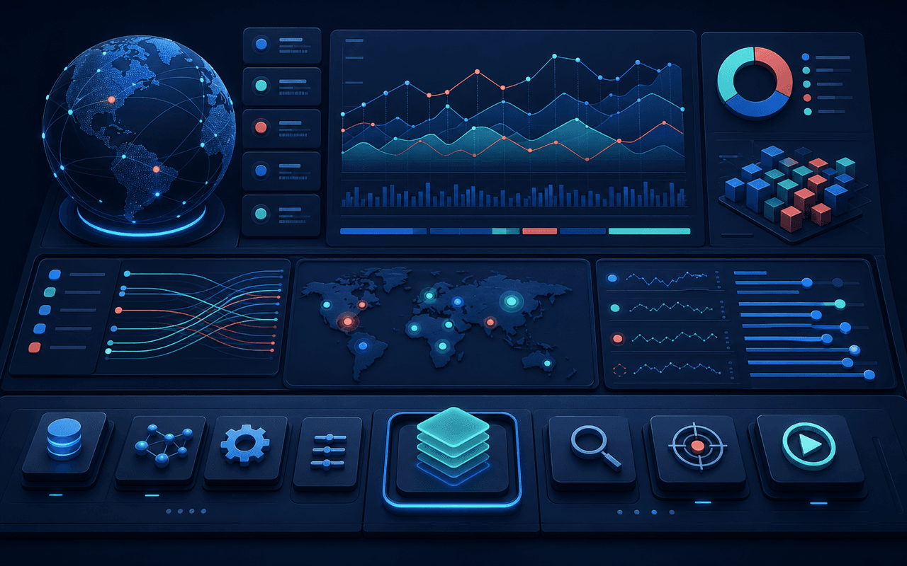
What Should a Dashboard Help Someone Decide?
Identify the audience, decisions, frequency, time pressure, and consequence of being wrong. An executive trend view, an operational queue, and an investigation workspace require different density and interaction. Choose measures because they change an action, not because the database already exposes them.
Define the comparison that gives each value meaning: target, previous period, baseline, peer group, range, or expected distribution. Show units, time zone, update time, definitions, and relevant exclusions. A precise number without context can create more confidence than the underlying data supports.
How Do You Create Clarity Without Removing Detail?
Use position, alignment, grouping, and restrained emphasis to create hierarchy. Keep formats and color meanings consistent. Place overview, exception, and next action first, then allow users to reveal supporting detail. Avoid giving every card equal weight or using decoration to compensate for unclear information architecture.
Keep filters and active scope visible, preserve state when users inspect detail, and make empty, delayed, partial, and error states explicit. Use tables when exact comparison matters and charts when pattern recognition matters. Provide text or tabular equivalents for information conveyed through color or shape.
| User need | Strong pattern | Common risk |
|---|---|---|
| See current state | Focused overview with context | Equal visual weight |
| Compare precisely | Aligned table and stable units | Decorative chart |
| Find an exception | Visible threshold and drill-down | Color-only meaning |
| Take action | Preserved scope and next step | Disconnected detail view |
Density becomes usable when hierarchy, context, and interaction match a real decision workflow.
How Should a Complex Dashboard Be Tested?
Test with representative volumes, long labels, missing values, extreme values, several screen sizes, keyboard navigation, zoom, and assistive technology. Ask users to detect a change, explain it, find the responsible records, and take the next action under realistic time constraints.
Measure task success, time to insight, filter use, false interpretation, performance, and support demand. HashBaze combines information architecture, data visualization, accessibility, frontend engineering, and analytics to make complex product data usable without hiding essential detail.
Frequently asked questions
Clear answers to the most important questions covered in this guide.
How Can HashBaze Help With This Work?
Explore our UI/UX design services or bring us your current product challenge for a focused technical conversation.